Learn Before
Concept
Baseline Material Color Theme
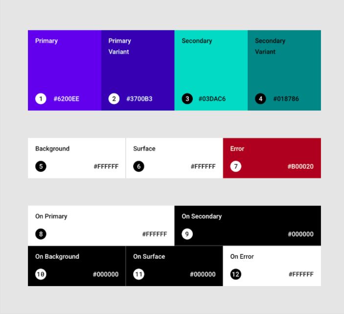
Material Design provides a built-in, baseline color theme that can be used out of the box. It includes default colors for:
- Primary and secondary colors
- Variants of primary and secondary colors
- Additional UI colors (e.g., backgrounds, surfaces, errors, typography, and iconography)
All of these colors can be customized for specific applications.
0
1
Updated 2026-07-06
Contributors are:


Who are from:


Tags
Design Science