Learn Before
Concept
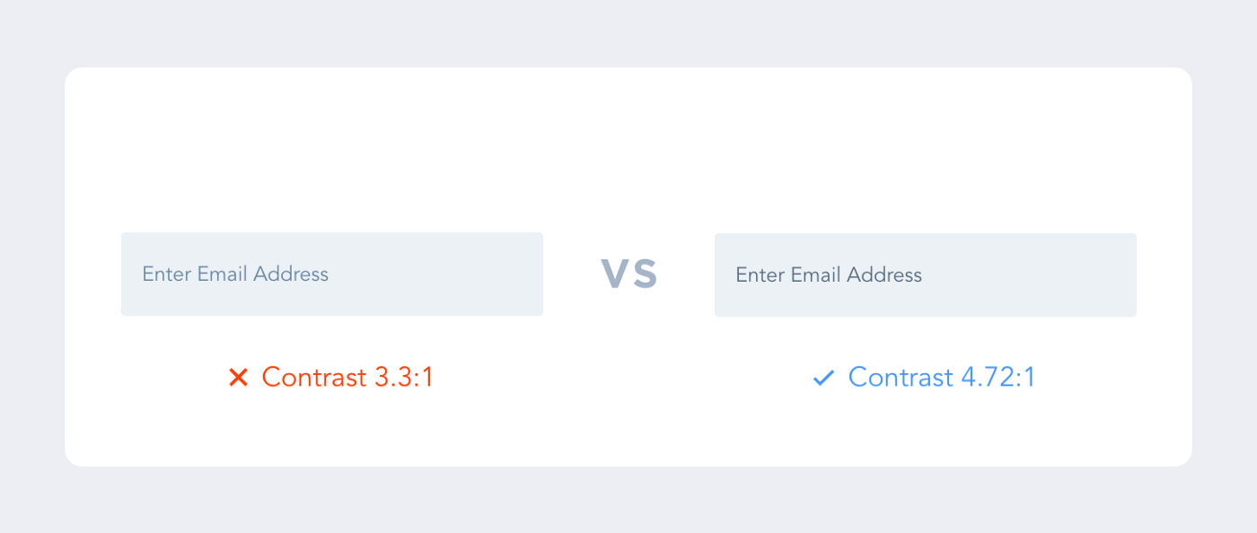
Pay Attention to Contrast
Contrast draws the user’s eyes to relevant information on the page and improves the accessibility of the product. The design should be inclusive to those who are visually impaired, meaning the colors must be different enough.
As seen in the image below, the 2nd box with the text stands out more because the grey color between the text and the box is more contrasted and different from each other compared to the 1st box with text.
0
1
Updated 2021-10-26


Tags
Design Science