Concept
Symptom Data Collection Timeline for COVID-19 Symptom Monitoring and Social Distancing in a University Population
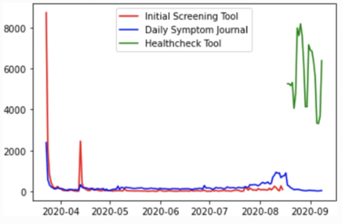
- A timeline shows the daily number of responses. The first thigh point in the initial screening tool corresponds to the date the link was included in the university learning management system.
- Spikes in the initial screening tool can be attributed to colleges sending out emails to their students with the link.
- The daily symptom journal had a constant number of people filling it out. The spike in August 2020 correlates with universities starting the fall term.
- The Health✓™ tool has high number of responses, with clear weekly cycle. The high response rate is due to the fact that it was required.
0
1
Updated 2021-03-31


Tags
SARS-CoV-2 (COVID-19)
Biomedical Sciences