
Learn Before
Bar Graph
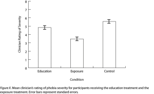
A bar graph is a visual representation generally used to present and compare the mean scores for two or more groups or conditions. Researchers conventionally use a bar graph when the independent variable plotted on the -axis is categorical.
0
1
Tags
KPU
Research Methods in Psychology - 4th American Edition @ KPU
Related
Correlation Coefficient
Sample Statistic
Descriptive Statistics in Experimental Research
Descriptive Statistics in Non-Experimental Research
Inferential Statistics
Understanding Descriptive Statistics
Scatterplot
Measures of Central Tendency
Measures of Dispersion
Forms of Statistical Relationship
Mean
Standard Deviation
Bar Graph
Line Graph
What is the primary purpose of using descriptive statistics in psychological research?
Match each category of descriptive statistics with the specific goal it accomplishes when a researcher is summarizing their data.
A researcher finds that a distribution of scores on a memory task is negatively skewed, meaning there are a few extremely low scores that pull the tail of the distribution to the left. Arrange the following measures of central tendency in order from the lowest numerical value to the highest numerical value based on this distribution's shape.
In a psychological study where a distribution of scores is highly skewed by a single extreme outlier, the mean is a more valid descriptive statistic than the median for evaluating the typical performance of the sample.
Measures of dispersion, such as the standard deviation and variance, are descriptive statistics used to describe the average scores within a research sample.
Tables in Research Reports
A psychologist studies the sleep patterns of college students and wants to summarize the collected data. Why must the psychologist report both a measure of central tendency (such as the mean) and a measure of dispersion (such as the standard deviation) to provide a complete descriptive summary of the sample's sleep duration?
A researcher records the number of errors made by five participants on a memory task: 3, 8, 2, 5, and 7. The range for this sample is _____.
A research team is summarizing data from a psychology study. Match each descriptive statistic on the left to the research situation on the right where it would be the most appropriate single summary to report.
A researcher reports that two groups of participants completed an identical mood-rating scale (scored 0–100). Group A had a mean of 60 and a standard deviation of 4, while Group B had a mean of 60 and a standard deviation of 22. Although both groups share the same measure of central tendency, a student analyzing these results should conclude that Group B's scores show substantially greater _____ than Group A's scores.
A researcher has collected scores on a stress questionnaire from 80 undergraduate participants and must decide which descriptive statistics to select and report. Arrange the following evaluative steps in the order that best supports an accurate, justified statistical summary of the data.
Define descriptive statistics and identify the two primary categories of quantitative techniques described in the text, including the specific measures associated with each.
Based on the case context, decide how the researcher should apply descriptive statistics to describe their data. Explain the two different types of measures the researcher needs to calculate and specify what each type of measure will communicate about the sample's performance.
A psychological researcher reports that a sample of participants completed a stress assessment, resulting in a mean score of and a standard deviation of . Explain what these specific descriptive statistics indicate about the scores of the participants in this sample.
Cohen's
Learn After
Error Bar
Under what condition do researchers conventionally use a bar graph to represent their data?
A researcher measures the average number of errors on a memory task for four age groups (children, adolescents, young adults, and older adults). A bar graph would be an appropriate way to display these results because the variable on the x-axis consists of distinct categories rather than a continuous scale.
A psychology researcher conducts an experiment to compare the average test scores of students using three different study methods: Visual, Auditory, and Kinesthetic. Match each component of a bar graph to the specific part of the study it represents.
Analyze the bar graph provided in the image. To correctly interpret the research findings and determine the relationship between the variables, arrange the following analytical steps in their logical order.
Based on the conventions of psychological research, why is the bar graph in the provided image an appropriate way to compare 'Group 1' and 'Group 2'?
A bar graph is a visual representation generally used to present and compare the _____ scores for two or more groups or conditions.
In the provided image, a bar graph is used to compare the mean health problems of two groups. If a researcher were evaluating the appropriateness of this visualization, they would conclude that a bar graph is the correct choice because the independent variable on the -axis is _____, which means there are no intermediate values to justify using a line graph.
A researcher investigating whether different exercise frequencies (daily, three times per week, once per week, never) affect mean mood ratings should display the results in a bar graph, because exercise frequency is a categorical independent variable plotted on the x-axis.
A researcher is deciding how to display results from several studies. Match each graph feature or variable characteristic to the conclusion it supports about how the data should be displayed.
A student researcher collected mean problem-solving scores from four groups: participants who studied in silence, with classical music, with pop music, and with white noise. They must decide whether a bar graph is the appropriate visualization. Arrange the following evaluative steps in their correct logical order.
State the primary purpose of a bar graph in psychological research, specifying the exact statistic it is conventionally used to present and compare, and describe the nature of the independent variable that is plotted on the -axis according to research conventions.
Based on this research design, explain why a bar graph is the appropriate visual representation for these results, referencing the nature of the independent variable and the specific statistics being compared.
A researcher is comparing the mean anxiety scores of participants who completed either a mindfulness intervention or a control activity. If the researcher plots the independent variable (intervention vs. control) on the -axis, what type of graph should they use to present the results and why?