
Learn Before
Scatterplot
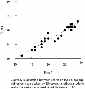
A scatterplot is a graph used to display the relationship between two quantitative variables, particularly when the independent variable on the -axis possesses a wide range of levels. In this type of visualization, each individual's scores are represented by a single point plotted at the intersection of the values on the and axes, with no lines connecting the data points.
0
1
Tags
KPU
Research Methods in Psychology - 4th American Edition @ KPU
Related
Correlation Coefficient
Sample Statistic
Descriptive Statistics in Experimental Research
Descriptive Statistics in Non-Experimental Research
Inferential Statistics
Understanding Descriptive Statistics
Scatterplot
Measures of Central Tendency
Measures of Dispersion
Forms of Statistical Relationship
Mean
Standard Deviation
Bar Graph
Line Graph
What is the primary purpose of using descriptive statistics in psychological research?
Match each category of descriptive statistics with the specific goal it accomplishes when a researcher is summarizing their data.
A researcher finds that a distribution of scores on a memory task is negatively skewed, meaning there are a few extremely low scores that pull the tail of the distribution to the left. Arrange the following measures of central tendency in order from the lowest numerical value to the highest numerical value based on this distribution's shape.
In a psychological study where a distribution of scores is highly skewed by a single extreme outlier, the mean is a more valid descriptive statistic than the median for evaluating the typical performance of the sample.
Measures of dispersion, such as the standard deviation and variance, are descriptive statistics used to describe the average scores within a research sample.
Tables in Research Reports
A psychologist studies the sleep patterns of college students and wants to summarize the collected data. Why must the psychologist report both a measure of central tendency (such as the mean) and a measure of dispersion (such as the standard deviation) to provide a complete descriptive summary of the sample's sleep duration?
A researcher records the number of errors made by five participants on a memory task: 3, 8, 2, 5, and 7. The range for this sample is _____.
A research team is summarizing data from a psychology study. Match each descriptive statistic on the left to the research situation on the right where it would be the most appropriate single summary to report.
A researcher reports that two groups of participants completed an identical mood-rating scale (scored 0–100). Group A had a mean of 60 and a standard deviation of 4, while Group B had a mean of 60 and a standard deviation of 22. Although both groups share the same measure of central tendency, a student analyzing these results should conclude that Group B's scores show substantially greater _____ than Group A's scores.
A researcher has collected scores on a stress questionnaire from 80 undergraduate participants and must decide which descriptive statistics to select and report. Arrange the following evaluative steps in the order that best supports an accurate, justified statistical summary of the data.
Define descriptive statistics and identify the two primary categories of quantitative techniques described in the text, including the specific measures associated with each.
Based on the case context, decide how the researcher should apply descriptive statistics to describe their data. Explain the two different types of measures the researcher needs to calculate and specify what each type of measure will communicate about the sample's performance.
A psychological researcher reports that a sample of participants completed a stress assessment, resulting in a mean score of and a standard deviation of . Explain what these specific descriptive statistics indicate about the scores of the participants in this sample.
Cohen's
Learn After
Which of the following best describes how data is visually represented in a scatterplot?
Examine the provided scatterplot graph. Based on the defining characteristics of this visualization in psychology research, match each graph component with its correct statistical description.
A researcher is investigating whether a student's 'Academic Major' (such as Psychology, Biology, or Art) influences their 'Grade Point Average' (GPA). To visualize the results, the researcher chooses to use the type of graph shown in the provided image. Is this an appropriate application of this visualization?
Analyze the visual structure of the provided scatterplot showing the relationship between 'Stress' and 'Symptoms'. Arrange the following steps in the correct logical order to explain how this visualization was constructed to represent the quantitative relationship between the variables.
Equal Axis Length in Scatterplots
Representing Overlapping Points in Scatterplots
Regression Line
A scatterplot is particularly useful for visualizing relationships when the independent variable on the -axis possesses a wide range of levels.
A psychology researcher is investigating the relationship between 'Stress' and 'Physical Symptoms.' Both variables are quantitative and have many possible numerical values. Based on the concept of a scatterplot, why is the visualization shown in the image appropriate for this study?
A reviewer evaluates a manuscript in which the authors used a bar graph to display the relationship between participants' age (a quantitative variable spanning a wide range of values) and their memory scores. The reviewer correctly argues that a(n) _____ should have been used instead, because it plots each individual's scores as a single point at the intersection of the two axes and preserves the full distribution of values rather than collapsing them into group means.
A health psychologist collects data from a sample of college students to examine the relationship between daily caffeine intake (in milligrams, ranging from 0 to 800 mg) and resting heart rate (in beats per minute, ranging from 60 to 110 bpm). They decide to construct a scatterplot of their data. Match each component of the study's data to its correct visual representation on this scatterplot.
A psychology researcher has collected survey data on 'screen time' and 'academic focus' from 100 participants. To systematically analyze the resulting scatterplot, arrange the following steps in the correct logical order, from the initial inspection of scales to the final detection of anomalies.
A student researcher is evaluating the draft figure shown in the image, which displays the correlation between daily 'Stress' on the -axis and 'Physical Symptoms' on the -axis for a sample of participants. A peer suggests connecting the data points with a continuous line from left to right to make the trend visually clearer. The student correctly evaluates this suggestion as methodologically inappropriate because there is no sequential, temporal, or continuous transition from one parti