Pre-1800 GDP Data Scarcity and Its Impact on Historical Graphs
For historical periods prior to 1800, and especially before 1300, GDP per capita data is exceptionally sparse. Due to this scarcity, economic historians construct graphs by drawing straight lines between the few available data points. This visualization method means that any potential year-to-year volatility in living standards is not represented in the charts.
0
1
Contributors are:


Who are from:


Tags
Social Science
Empirical Science
Science
Economy
CORE Econ
Economics
Introduction to Microeconomics Course
The Economy 2.0 Microeconomics @ CORE Econ
Ch.1 Prosperity, inequality, and planetary limits - The Economy 2.0 Microeconomics @ CORE Econ
Related
History’s Hockey Stick: Stagnant Income Before Sustained Growth
Capitalism, Causation, and History’s Hockey Stick
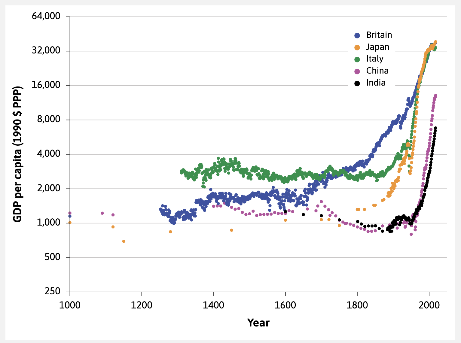
India's Progress in Living Standards and Persistent Poverty (14th Century to Present)
Living Standards Visualization: Pre-1800 Limitations
Intra-Country vs. Inter-Country Inequality in the 14th-17th Centuries
Purchasing Power Parity (PPP)
Latin American Growth
Figure 1.1: The History's Hockey Stick Graph of GDP Per Capita
China's Economic Decline
Modern Global Wealth Hierarchy (2018): Comparisons of Japan, India, Britain, US, and Norway
Britain's Early and Gradual 'Hockey Stick' Kink
Japan's Sharp 'Hockey Stick' Kink around 1870
Pre-1800 GDP Data Scarcity and Its Impact on Historical Graphs
Data Sources for the History's Hockey Stick Graph
Understanding and Interpreting Ratio Scale Graphs
An economist plots the GDP per capita of two countries, Country X and Country Y, from 2000 to 2020 on a graph with a ratio scale on the vertical axis. In 2000, Country X had a much higher GDP per capita than Country Y. However, over the 20-year period, Country Y experienced a significantly faster average annual growth rate than Country X. Based on this information, which statement best describes how the two lines would appear on the graph?
Choosing the Right Economic Visualization
Consider two countries, Country A and Country B. In a given year, Country A's income per person is $40,000 and it increases by $2,000 the following year. In the same period, Country B's income per person is $10,000 and it increases by $1,000. Which of the following statements provides the most accurate economic comparison?
An economic historian is studying two countries, Alpha and Beta, over a 50-year period. She plots their income per person on a graph where the vertical axis uses a ratio scale. The line for Country Alpha starts at a much higher point on the axis than the line for Country Beta. Over the 50 years, the line for Alpha is nearly flat, while the line for Beta is a steep, upward-sloping straight line. What is the most accurate conclusion the historian can draw from this graph?
Evaluating an Economic Analysis
When examining a graph that plots a country's income per person over several decades using a ratio scale on the vertical axis, a straight, upward-sloping line signifies that the absolute (e.g., dollar amount) increase in income per person was constant year after year.
Evaluating an Investment Recommendation
Interpreting Economic Performance
An economic analyst is comparing two countries, Country A and Country B. In 1990, Country A's income per person was ten times that of Country B. Over the subsequent 30 years, Country A's income per person grew at an average rate of 1% per year, while Country B's grew at an average rate of 7% per year. Which of the following statements provides the most accurate analysis of their relative economic situations after this 30-year period?
An economic historian is comparing the long-term development of two nations, Country A and Country B, by plotting their income per person on a graph with a ratio scale on the vertical axis. Historical data reveals the following:
- Country A had a relatively high income per person 300 years ago and has experienced a slow but consistent proportional increase in income ever since.
- Country B had a very low income per person 300 years ago, which remained stagnant for the first 250 years, but has grown at an extremely rapid proportional rate over the last 50 years.
Which of the following statements best describes how the plots for these two countries would appear on the graph?
Delayed Economic Growth in China and India Until Post-Colonial Independence
Catch-Up Growth of 'Latecomer' Economies: India and China
Figure 3.7: Evolution of GDP per Capita Relative to the US (US = 100) at Purchasing Power Parity (2009–2023)
Capitalism, Causation, and History’s Hockey Stick
Comparing GDP Levels and Growth Rates:
India's Progress in Living Standards and Persistent Poverty (14th Century to Present)
Living Standards Visualization: Pre-1800 Limitations
Latin American Growth
China's Economic Decline
Britain's Early and Gradual 'Hockey Stick' Kink
Japan's Sharp 'Hockey Stick' Kink around 1870
Pre-1800 GDP Data Scarcity and Its Impact on Historical Graphs
Data Sources for the History's Hockey Stick Graph
Wealth and Poverty Before the 'Hockey Stick' Kink
The Puzzle of the Hockey Stick: Why Stagnation Before Growth?
Dual Narrative of the GDP Hockey Stick: Growth and Stagnation
Economic Growth Rate
The Volatility of 'Hockey Stick' Economic Growth
An economic historian examines a graph of average income per person for Country X and Country Y over the last millennium. The graph shows that for centuries, both countries had very low, stagnant average incomes. Around the year 1750, Country X's average income began to increase sharply and has continued to grow since. Country Y's average income did not begin its sharp, sustained increase until around 1960. Today, Country X's average income is substantially higher than Country Y's. What does this pattern suggest is the primary reason for the large income gap between the two countries today?
Interpreting Historical Income Data
Consider a scenario where two drivers are on a wide, empty highway. Driver A chooses a speed based only on the legal speed limit and their personal comfort, and this choice does not affect the travel time of Driver B. Similarly, Driver B chooses a speed based on the same factors, and this choice does not affect Driver A's travel time. Which of the following modifications would be necessary to transform this situation into a social interaction?
Analyzing the 'Hockey Stick' Pattern of Economic Growth
Imagine a graph showing the average income per person for four countries (A, B, C, D) from the year 1500 to the present. For all four countries, the income line is flat and low until around 1800. After 1800, Country A's income line rises sharply. Country B's income line begins to rise sharply around 1900. Country C's income line begins a modest rise around 1950. Country D's income line remains flat and low throughout the entire period. Based on this information, which statement provides the most accurate analysis of the situation?
An economic historian is studying two countries, Country A and Country B. Both countries experienced centuries of near-zero growth in average income. Around 1820, Country A's average income began to grow rapidly and has continued to do so. Country B's average income remained stagnant until around 1980, at which point it also began to grow rapidly. Based on this information, which of the following conclusions is most likely to be true about the economic situation of these two countries today?
Interpreting the 'Hockey Stick' Graph
The 'history's hockey stick' graph illustrates that the sharp, sustained increase in living standards began at approximately the same time for all major economies, leading to a synchronized global take-off.
Catch-Up Growth of 'Latecomer' Economies: India and China
Analyzing a Nation's Economic Trajectory
An economic historian creates a graph showing the historical path of average income for four hypothetical regions from the year 1000 to the present. All regions start with a long period of flat, low income. Match each region to the description that best fits its economic trajectory as described below.
- Region A: Income begins a steady, gradual rise around 1650.
- Region B: Income remains flat until around 1870, when it begins to rise very sharply.
- Region C: Income starts to grow rapidly, but not until the late 20th century.
- Region D: Income remains flat and low throughout the entire period shown.
Analyzing the 'Hockey Stick' Pattern of Economic Growth
History’s Hockey Stick: Stagnant Income Before Sustained Growth
Capitalism, Causation, and History’s Hockey Stick
Italy's Higher Living Standards in the 14th Century
Pre-1800 GDP Data Scarcity and Its Impact on Historical Graphs
Data Sources for the History's Hockey Stick Graph
Official Caption for Figure 1.1 (History's Hockey Stick)
Global Disparities in Living Standards by 2018
The Foundational Role of Empirical Data in Economics
A graph displays the estimated average income per person for several major countries from the year 1000 to the present. The data shows that for most of this millennium, average incomes were low and changed very little. Then, beginning in the 18th and 19th centuries for some countries, incomes started to rise very rapidly. This overall pattern is often described as a 'hockey stick' shape. Based on this information, what is the most significant analytical conclusion that can be drawn?
Interpreting Historical Economic Data
Based on the general pattern shown in the 'history's hockey stick' graph of GDP per capita, it is accurate to conclude that for most of the countries depicted, the average person's material living standard in the year 1600 was fundamentally similar to that of the year 1200.
Analyzing Economic Divergence
Interpreting Historical Data Visualization
A graph shows the average income per person for a country like Britain from the year 1000 to the present. The graph has a distinct shape. Arrange the following descriptions of the country's economic history in the correct chronological order as depicted by this graph.
A graph of average income per person from the year 1000 to the present for several countries shows a long, flat section followed by a sharp, upward bend. Match each feature or observation from this type of graph to its correct economic interpretation.
A graph of average income per person for a country from the year 1000 to 2018 shows the period before 1700 as a long, nearly flat horizontal line. Which of the following statements provides the most accurate interpretation of this flat portion of the graph?
An economic historian is studying short-term, year-to-year economic volatility (e.g., the impact of a major famine) in a European country during the 15th century. They consult a long-run graph of average income per person from the year 1000 to the present, which depicts the 15th century as part of a long, nearly flat line. Why is this graph likely to be a misleading source for investigating year-to-year volatility during that specific period?
The historical graph of average income per person, which shows a long period of economic stagnation followed by a sudden and sharp increase in growth, is commonly referred to as the 'history's ____ ____' graph.
Based on the general pattern shown in the 'history's hockey stick' graph of GDP per capita, it is accurate to conclude that for most of the countries depicted, the average person's material living standard in the year 1600 was fundamentally similar to that of the year 1200.
Analyzing Economic Divergence
Learn After
Latin American Growth
China's Economic Decline
India's Progress in Living Standards and Persistent Poverty (14th Century to Present)
Britain's Early and Gradual 'Hockey Stick' Kink
Japan's Sharp 'Hockey Stick' Kink around 1870
Example of Pre-1300 Data Scarcity: Chinese GDP Estimates
An economic historian examines a graph depicting a region's estimated average income from the 14th to the 17th century. The graph shows a single, long, straight line with a very slight upward slope. What is the most likely explanation for the straight-line appearance of this data?
Interpreting Historical Economic Data
A graph showing a perfectly straight, flat line for a country's average income between the years 1100 and 1300 definitively proves that living standards were completely stable, without any year-to-year changes, during that period.
Critiquing Historical Economic Interpretations
Two economic historians are analyzing a chart of estimated GDP per capita for a particular region from the year 1150 to 1300. The chart displays a single, almost perfectly straight line connecting the data point for 1150 to the data point for 1300.
Historian 1 argues: 'This straight line demonstrates that the region experienced an exceptionally long period of economic stability, free from significant booms or crises.'
Historian 2 argues: 'This chart tells us very little about the actual economic fluctuations during this period. The straight line is likely just a visual simplification due to a lack of data points between 1150 and 1300.'
Based on the principles of constructing historical economic data, which historian's conclusion is more justifiable?
Limitations of Historical Economic Visualizations
Interpreting New Historical Economic Data
Evaluating Historical Economic Representations
Evaluating a Historical Economic Claim
Revising Historical Economic Narratives