Rising Within-Country Income Inequality in Recent Decades
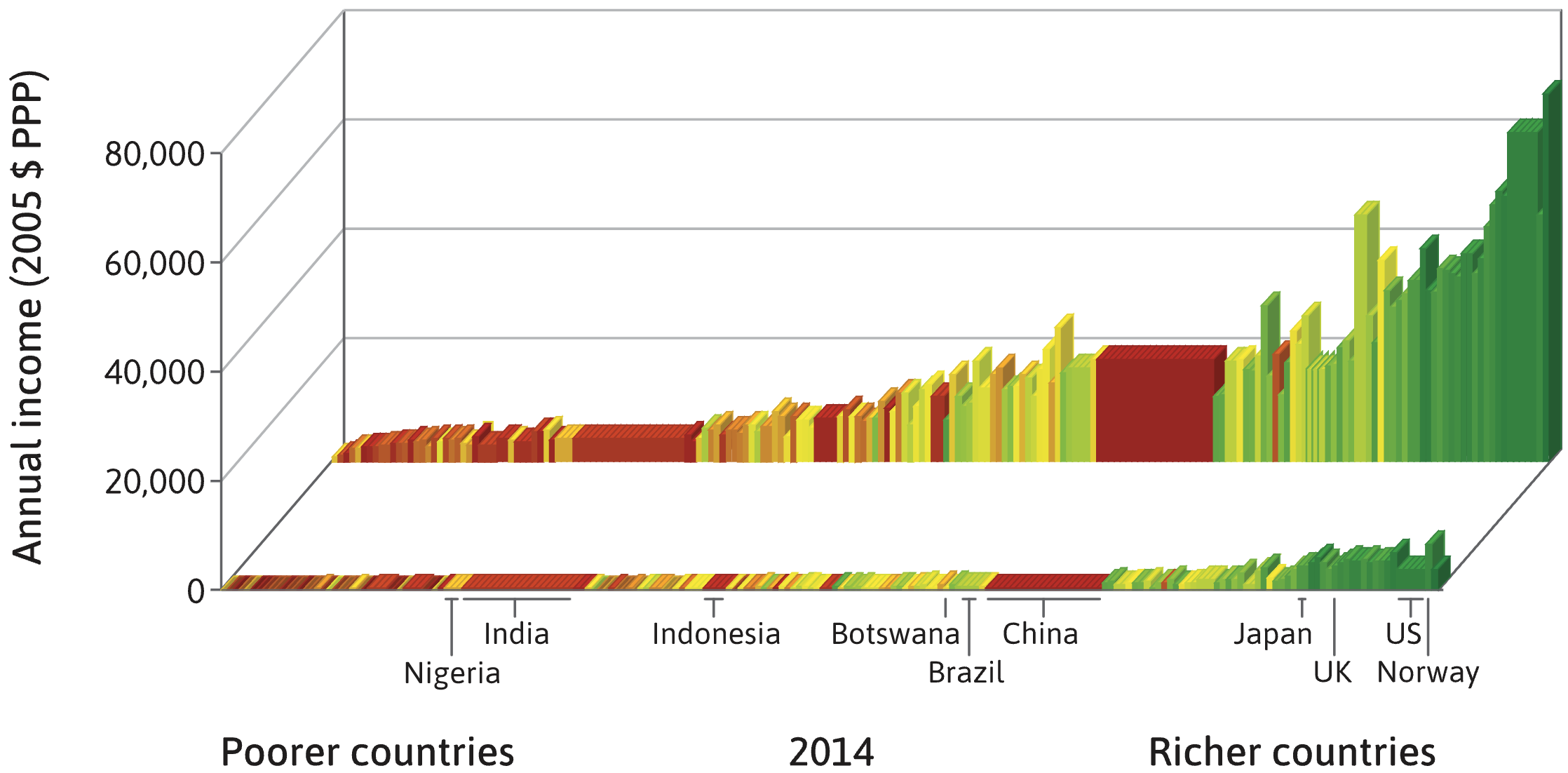
While extreme poverty has seen a global decline, income inequality within countries has not only persisted but has markedly increased in recent decades. This trend is visible in income distribution visualizations, such as those from 2014, which reveal a substantial gap between the top 10% of earners and the rest of the population in many affluent and middle-income nations. This disparity can be quantified using the rich/poor ratio, which compares the average income of the wealthiest 10% to the poorest 10%. For instance, this ratio has been shown to be relatively low in egalitarian countries like Norway (5.4) while being much higher in places like the United States (16) and Botswana (145).
0
1
Contributors are:


Who are from:


Tags
Social Science
Empirical Science
Science
Economy
Ch.1 The Capitalist Revolution - The Economy 1.0 @ CORE Econ
The Economy 1.0 @ CORE Econ
CORE Econ
Economics
Introduction to Microeconomics Course
Ch.1 Prosperity, inequality, and planetary limits - The Economy 2.0 Microeconomics @ CORE Econ
The Economy 2.0 Microeconomics @ CORE Econ
Related
Our World in Data
The Economist
Black Market Definition and Types Citation
Types of Taxes Citation
Subfields of Economics Citation
Economic Policy Institute
Visualizing Income Distribution: A Comparison of Countries by GDP Per Capita and Income Deciles
Rising Within-Country Income Inequality in Recent Decades
CORE Econ Fact Checker
A student is writing a research paper that requires comparing long-term global trends in poverty, literacy, and public health using interactive charts and downloadable datasets. Which of the following online resources is specifically designed to best support this type of data-driven, large-scale historical analysis?
You are researching different facets of the US economy. Match each research goal with the online resource most likely to provide the most relevant and in-depth information or perspective.
Selecting an Appropriate Economic Research Source
Evaluating Economic Information Sources
A student investigating the economic impact of specific government policies on low- and middle-income American workers would find the most specialized and mission-driven research from 'The Economist', a publication primarily known for its broad, international coverage of finance and free-market principles.
Contrasting Perspectives in Economic Reporting
Predicting Research Focus
An economist is analyzing a public policy proposal. One online resource they consult is a global news publication with a long-standing editorial perspective favoring free markets. Another is a non-profit think tank that states its mission is to research issues affecting low- and middle-income families. How would the analysis from these two sources likely differ in their evaluation of a proposal to significantly increase the minimum wage?
Predicting Research Focus
Differentiating Economic Information Sources
Visualizing Income Distribution in 1990: A Comparison of Countries by GDP Per Capita and Income Deciles
Visualizing Income Distribution: The Richest and Poorest by GDP Per Capita and Income Deciles
Stark Income Disparities: Comparing Average Incomes and Inequality Between Countries
Comparison of Figure 1.4 and Figure 1.5 for Visualizing Income Inequality
Rising Within-Country Income Inequality in Recent Decades
World Income Distribution in 2000
A chart visualizes income distribution for various countries. Each country is represented by a set of ten bars, with the height of each bar showing the average income for a 10% segment (decile) of its population, from the poorest decile in the front to the richest in the back. The countries themselves are arranged horizontally from left to right by increasing overall average income.
Consider two countries, Country A and Country B. Country A is located to the right of Country B on the chart. The bars for Country A show a dramatic increase in height from front to back, with the rearmost bar being exceptionally tall compared to the frontmost bar. The bars for Country B are all of a more similar, moderate height.
Which statement provides the most accurate analysis of these two countries based only on this information?
Analyzing Between-Country vs. Within-Country Inequality
Interpreting a Country's Income Distribution Profile
A chart visualizes global income by arranging countries from poorest to richest (left to right) and showing income distribution within each country using ten bars (deciles), from the poorest 10% (front) to the richest 10% (back). The height of each bar represents the average income for that decile. Match each country's economic description to its likely appearance on the chart.
Evaluating a Visualization of Global Income Distribution
A specific type of chart visualizes income distribution by arranging countries from poorest to richest and showing the average income for ten population groups (deciles) within each country. A key rule for this chart is that a household's total income is assumed to be divided equally among all its members, including children.
True or False: Based on this methodology, if the bar representing the wealthiest 10% of the population in Country X is taller than the corresponding bar for Country Y, one can conclude with certainty that the average household income for the wealthiest households in Country X is also higher than in Country Y.
Analyzing the Impact of Economic Policies on Income Distribution
You are presented with a chart that visualizes global income distribution. Countries are arranged from left to right by increasing average income. For each country, a series of ten bars shows the average income for each 10% segment of the population, from the poorest in the front to the richest in the back. To determine which of two countries, Country X and Country Y, has greater within-country income inequality, you would perform a series of analytical steps. Arrange the following steps in the correct logical order to make this comparison.
A chart visualizes income distribution by arranging countries from poorest to richest and using a series of ten bars to represent the average income for each 10% segment of the population (decile) within each country. If, for a single country, the bar representing the richest 10% is exceptionally tall while the bar for the poorest 10% is very short, this large height difference is a direct visual measure of high _______________.
Interpreting Multi-Dimensional Income Data
Global Trend of Shrinking Extreme Poverty
Figure 1.5: Visualizing Within-Country and Between-Country Income Distribution (1980 vs. 2020)
The 'Skyscrapers' in Global Income Distribution Visualizations
Figure 1.4: A 2019 Snapshot of Global Income Distribution
Hypothetical 14th Century Global Income Distribution
Visualizing Income Distribution: A Comparison of Countries by GDP Per Capita and Income Deciles
Our World in Data
Data-Driven Policies to Reduce Inequality
Identifying Causal Mechanisms in Economics
Taxation as a Source of Economic and Social Data
The Social Role of Economic Data
The Interdisciplinary Nature of Economic History
Data Availability: A Contrast Between Historical and Modern Economists
The Interplay of Data and Theory in Economics
Rising Within-Country Income Inequality in Recent Decades
An economist develops a highly sophisticated mathematical model to explain the causes of wealth inequality. However, they have not yet consulted any historical data, such as tax records or national accounts, to see if the model's assumptions align with observed facts. Based on the arguments about the fundamental role of data in modern economic research, what is the primary weakness of this economist's initial approach?
Resolving a Debate on Economic Inequality
Based on the discussion about the fundamental role of data in economic research, match each economist's specific argument or shared principle to the statement that best describes it.
The Dual Function of Data in Economic Inquiry
The Shift in Economic Methodology
Based on the principles of data-driven economic inquiry, the systematic collection and public presentation of empirical facts about inequality is considered a sufficient condition to resolve the social and political conflicts that arise from wealth disparities.
Investigating the Rise of Income Inequality
Evaluating Competing Economic Explanations
An economist is investigating the recent rise in wealth disparity in a specific country. Based on the principles of data-driven economic inquiry, arrange the following research steps into the most logical and effective sequence.
Two groups are debating a new policy to address economic inequality. Group 1 presents a highly complex economic theory predicting negative outcomes but offers no historical data to support its claims. Group 2 presents extensive historical data from other countries suggesting the policy would be effective but does not offer a detailed theory to explain the mechanisms. Based on the principles of modern, data-driven economic inquiry, which group's position offers a more constructive starting point for a rational policy discussion?
World Inequality Database (WID)
Learn After
Income distribution in Singapore and Liberia
India's Progress in Living Standards and Persistent Poverty (14th Century to Present)
The 90/10 Ratio
Latin American Growth
China's Economic Decline
Comparative Analysis of National Income Distribution
Country A has a high average income per person and a rich/poor ratio of 18. Country B has a moderate average income per person and a rich/poor ratio of 5. The rich/poor ratio is calculated by dividing the average income of the wealthiest 10% of the population by the average income of the poorest 10%. Based solely on this information, which statement is the most accurate conclusion?
Interpreting Income Inequality Ratios
Evaluating a Measure of Income Disparity
Evaluating Income Distribution in a Hypothetical Nation
Analyzing Claims about National Prosperity
A country's high average income is a reliable indicator that it also has low income inequality (a small gap between the average income of the richest 10% and the poorest 10%).
Consider a country where the gap between the rich and poor is measured by dividing the average income of the wealthiest 10% of the population by the average income of the poorest 10%. If a new government policy successfully doubles the average income of the poorest 10%, it is certain that this measure of inequality will be cut in half.
Country Alpha and Country Beta both have a similarly high average income per person. However, a visualization of their income distributions shows that Country Alpha has a much taller column representing the income of its wealthiest 10% compared to Country Beta. The columns representing the poorest 10% in Country Alpha are also much shorter than in Country Beta. What is the most logical conclusion that can be drawn from this information?
Analyzing Simultaneous Trends in Income and Inequality
The 'Skyscrapers' in Global Income Distribution Visualizations