Visualizing Income Distribution in 1990: A Comparison of Countries by GDP Per Capita and Income Deciles
The color-coded diagram reveals shifts in countries' economic rankings between 1980 and 1990. China, previously depicted in dark red as one of the poorest countries, has since become wealthier. Uganda, another country initially colored red, now occupies a central position among the yellow-colored countries with intermediate wealth. Additionally, several more prominent columns have emerged, indicating a rise in income inequality in numerous countries during the 1980s.
0
1


Tags
Social Science
Empirical Science
Science
Economy
Ch.1 The Capitalist Revolution - The Economy 1.0 @ CORE Econ
The Economy 1.0 @ CORE Econ
CORE Econ
Related
Visualizing Income Distribution in 1990: A Comparison of Countries by GDP Per Capita and Income Deciles
Visualizing Income Distribution: The Richest and Poorest by GDP Per Capita and Income Deciles
Stark Income Disparities: Comparing Average Incomes and Inequality Between Countries
Comparison of Figure 1.4 and Figure 1.5 for Visualizing Income Inequality
Rising Within-Country Income Inequality in Recent Decades
World Income Distribution in 2000
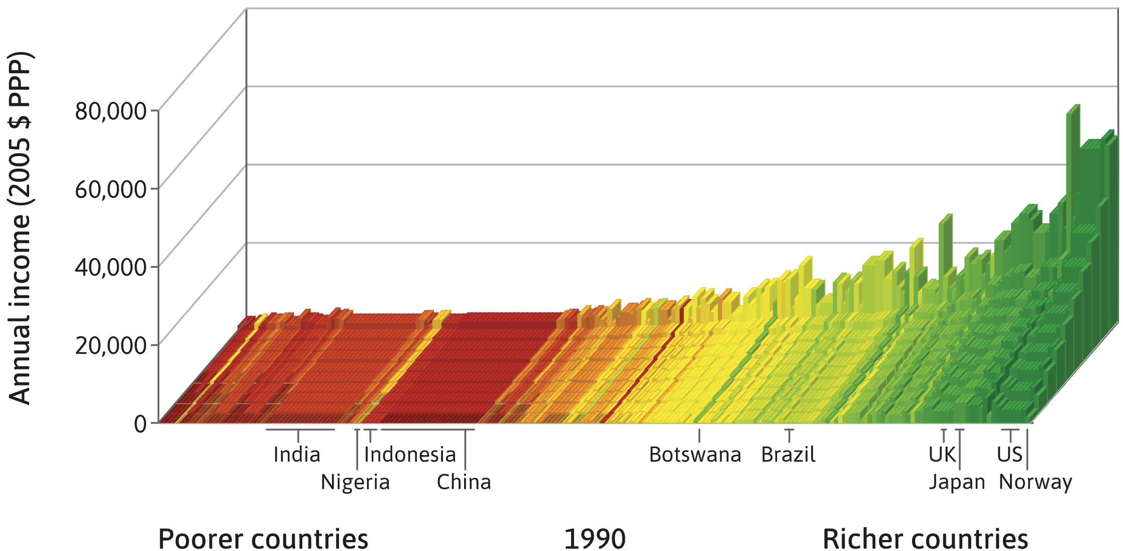
A chart visualizes income distribution for various countries. Each country is represented by a set of ten bars, with the height of each bar showing the average income for a 10% segment (decile) of its population, from the poorest decile in the front to the richest in the back. The countries themselves are arranged horizontally from left to right by increasing overall average income.
Consider two countries, Country A and Country B. Country A is located to the right of Country B on the chart. The bars for Country A show a dramatic increase in height from front to back, with the rearmost bar being exceptionally tall compared to the frontmost bar. The bars for Country B are all of a more similar, moderate height.
Which statement provides the most accurate analysis of these two countries based only on this information?
Analyzing Between-Country vs. Within-Country Inequality
Interpreting a Country's Income Distribution Profile
A chart visualizes global income by arranging countries from poorest to richest (left to right) and showing income distribution within each country using ten bars (deciles), from the poorest 10% (front) to the richest 10% (back). The height of each bar represents the average income for that decile. Match each country's economic description to its likely appearance on the chart.
Evaluating a Visualization of Global Income Distribution
A specific type of chart visualizes income distribution by arranging countries from poorest to richest and showing the average income for ten population groups (deciles) within each country. A key rule for this chart is that a household's total income is assumed to be divided equally among all its members, including children.
True or False: Based on this methodology, if the bar representing the wealthiest 10% of the population in Country X is taller than the corresponding bar for Country Y, one can conclude with certainty that the average household income for the wealthiest households in Country X is also higher than in Country Y.
Analyzing the Impact of Economic Policies on Income Distribution
You are presented with a chart that visualizes global income distribution. Countries are arranged from left to right by increasing average income. For each country, a series of ten bars shows the average income for each 10% segment of the population, from the poorest in the front to the richest in the back. To determine which of two countries, Country X and Country Y, has greater within-country income inequality, you would perform a series of analytical steps. Arrange the following steps in the correct logical order to make this comparison.
A chart visualizes income distribution by arranging countries from poorest to richest and using a series of ten bars to represent the average income for each 10% segment of the population (decile) within each country. If, for a single country, the bar representing the richest 10% is exceptionally tall while the bar for the poorest 10% is very short, this large height difference is a direct visual measure of high _______________.
Interpreting Multi-Dimensional Income Data
Global Trend of Shrinking Extreme Poverty
Figure 1.5: Visualizing Within-Country and Between-Country Income Distribution (1980 vs. 2020)
The 'Skyscrapers' in Global Income Distribution Visualizations
Figure 1.4: A 2019 Snapshot of Global Income Distribution
Hypothetical 14th Century Global Income Distribution